One of the Current exhibitions on at the V&A is Decode:Digital Design Sensations, it communicates the idea of these digitally growing plants and a mechanical eye, but most importantly the idea that this eye mirrors the blink of a visitors gaze.
The exhibition shows the latest developments in digital and interactive design, from screen based design to large scale installations. I think it pulls together this idea about the gaze towards design, in the design world of today.
It seems that the hardest thing about writing my essay is the sheer amount of information there is on my subject and debate around it. I have to narrow it down to a couple of subjects and this has made it hard to just concentrate on a few aspects of this idea of femininity within society.
Thursday, 18 March 2010
Below is a link to a web page I found on statistics about young girls and how unhappy they are with their body image even at the early age of 10!
It's very shocking, has been useful for my essay...
A Beautiful Lie. This shows how body image can be so manipulated and airbrushed. It makes you rethink what you see in the magazines and on tele and adverts. Is this perfected look really ever something girls will be able to have.
Below is a link to an article that I just thought was pretty shocking about a mother who is a 'real living barbie' who let her 16 year old daughter be injected with botox.
It's so common nowadays for girls to be unhappy with how the look and this is because they turn to things they see in the media and to Barbie as their idols - this object of perfection.
The Henry Moore Institute, Leeds, is known for it's award-winning exhibitions, being a fantastic research centre and also a sculpture archive. In it's latest exhibition, the definition of sculpture has been adapted, in which Alan Johnstons' drawings give a new perspective on a familiar space. The exhibition, named, 'Drawing a Shadow: No Object', see's his drawings all over the walls of the Henry Moore institute and is placed in the main gallery.
Without reading about the exhibition before you go, it is hard to recognise what the exhibtion actually is when you first walk in, you find yourself looking for work on the walls. It was not what I thought it would be, assuming it was drawings in the most literal sense. Where as, this exhibition displays and communicates the ideas of a structures shadow being formed against the walls of the gallery. The shadows are in fact the shadows of former buildings which stood before The Henry Moore Institute, so with the exhibition is formed a bit of historical knowledge.
Looking at the website after being to the exhibition, I found a quote from the curator and writer Charles Esche, who sums up the effect, that Johnston's drawings have upon the viewer: 'Alan Johnston's work is, at times, almost invisable - but almost not invisable at all.' I think this is a very true and reflective quote of the exhibition and is the feeling I left with.
The historical feel that people get from it, isn't just what's felt through observing it as a space, working with the pencil and applying it directly to the wall also brings the audience this feeling of touch and makes the experience more personal, as you know someone has been in this big space and applied their mark to it. Also, the drawings are all linked and one carry's on to the other wall space, this gives it a feeling of structure but also continuity and which reflects the idea of rigidness, seen in any building, as well as the idea of a shadow always being there.
Accompanying the rooms of shadow are some intricately placed drawings/paintings, showing his ideas and thoughts on the space and project at hand.
The most striking thing about the exhibition is that although it is not 3D in the literal sense, the drawings done, highlight the galleries as sculptural spaces. In such a big space, the structures shadows on the wall are quite overwhelming, then to get close to it and find that from afar the marks look simple and painless, but when you get close, the pencil marks are very defined and look as though the have been scratched in painstakingly. Looking round the exhibition, it's amazing to see that Johnston managed to maintain the same pressure of pencil the whole way round, from wall to wall.
Described by Johnston himself, their is a deliberate simplicity within the work, which he describes as giving the audience an experience which is '...neutral and clear.' This is often a way to describe the idea of shadows that are formed in our everyday lives - putting the audience and ease, described by Johnston as 'bringing a sense of themselves'. Another simplicity put to Alan Johnston which is clever, is the idea of the work being at the height it is on the walls. This draws the audiences eyes up, then for them to realise and observe fully the space that they have entered and are in. The drawings from almost brings out the idea of parts of the structure being windows and this is turn makes the audience in the space feel almost watched or looked upon.
Alan Johnston is particularly interested by the Japanese culture, which can then be said to be seen through his soft and intricate pencil marks on the walls. This idea of Japanese culture is also shown through the pieces of architectural sculpture pieces, encased in tall display cabinets, at eye height - ideas for his back garden in fact.
His influence of Zen - (The aim of Zen practice is to discover a Buddha nature within each person, through meditation and mindfulness of daily experiences). This idea of Zen is transcribed through Johnstons work throughout the exhibition, seeing it's focus on self-awareness. As the audience you can feel over-looked, possibly making you feel uncomfortable.
Over all the exhibition provokes the idea of the relationship between art and architecture in an interesting and thoughtful way. The detail and awareness (Zen influence again?) which has gone into the work and efforts of Alan Johnston are also important, through doing this project and drawing on the walls, Johnston's measurements were so accurate, that he even noticed a one centimetre imbalance on two facing walls whilst drawing.
Relating to my subject for my final essay, I watched Blue Velvet...this is what I found/observed, concentrating on women being objectified within film and in society:
The First Things First 2000 Manifesto, was written and launched by Adbusters magazine in 1999 and is a follow up of the original text by Ken Garland, a British designer, which was published in 1964. It argues that designers should discard the work of the advertising community, through designing, but not through accommodating consumerism within society. It questions the idea of value-free design, which is contested between creatives, some who do believe that they should be concerned about the need for values throughout design and the opposing creatives who believe it should be value free.
Rick Poyner, who writes this re-vamped maifesto of 2000, explains that lulled by the economic boom, designers have shown little focus in showing work for themselves as well as the public and instead working for society, these creatives should be using their skills in a more 'creative' way and be used for a more. A quote I took from this text was: 'Design was in danger of forgetting it's responsibility to struggle for a better life for all.' (Poyner, 2000, p11). His concepts communicate the idea of design being too commercial and too much effort being put on triviality. His theories tie in with the idea of the design of today being for the ruling class.
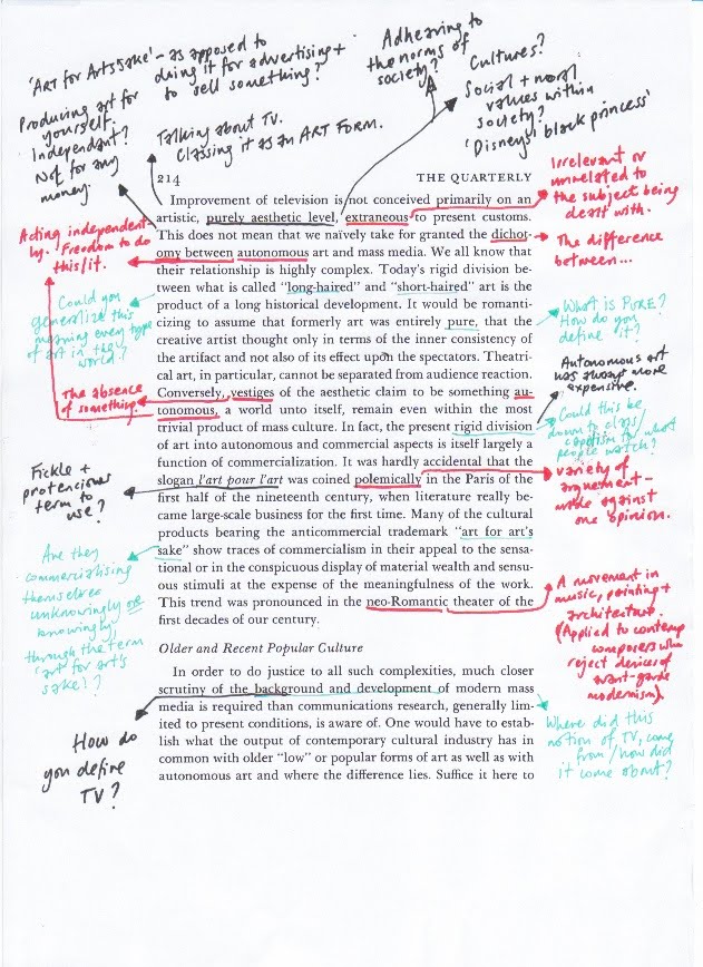
Many people believe that designers use their artistic gifts to reach goals within client-set parameters. Art is everywhere and many times this art is a tool, it doesn't appear pure and existing for itself. Many designers talk of how they have no time to make art because of work. As Matt Soar states: 'It's very easy for a profession to take it's current concerns and obsessions and assumptions for granted; to assume these are natural, that this is the way things are.'
However some people believe that advertising can help society in many ways, providing information and using loaded messages to produce an emotional rather than rational response to information presented to an audience. The desired response is really to challenge peoples views towards a subject and make people feel a certain way towards certain things.
A lot had changed since the original publishing of the 1st Manifesto, through consumerism and capitalism within society and so it seems that the 2000 manifesto is in place to make designers in todays society question their ways of working and ask themselves whether they are working ethically and morally.
I've been thinking about my essay and started to pick up books, but his is something I was sent by a friend who thought of me and knew what I was doing for my essay.
It's perfect! I'm pretty in love with it as well, and amazing bit of film/animation!
Main issues addressed by your essay and the thrust of you argument:
- Challenging peoples perspectives and stereotypes of the Barbie doll. Looking at a negative out look towards the doll culture, how dolls and 'The Barbie' can bring fun and a comfort to young girls, but how they can also create or be victimizing to females.
- Barbie is a bad influence on women and they are fed an unhealthy body image, how far do these people go to aquire this idealistic look.
- Women being seen as objects/items: 'to-be-looked -at-ness'
What visual material will you look at?
- Films, where the female is seen as a sexual object. Blue Velvet? - A strong recurring theme in Blue Velvet is voyeurism. In this scene, Jeffrey unwillingly takes the role of the "voyeur", while he hides in Dorothy's closet watching her get undressed, unbeknown to her.
- Comic books, where the female is seen as a sexual object.
We had a seminar just before christmas which was on The Gaze, this got me excited about my essay proposal and ideas for my dissertation. Everything that Richard spoke about was really interesting and I think ties in with my little idea of Barbie' and the promotion of body image.
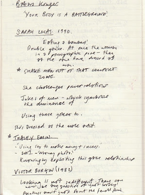
Here are some notes I took in The Gaze seminar, these should really help me with research and understanding my subject more:
Adorno's (1941) article 'On Popular Music', stresses his feelings towards 'popular music' of which he states is characterized by it's difference from serious music. His article is split into 3 seperate ideas.
-The Musical Material.
-Presentation of the material. &
-Theory about the Listener.
He talks about the idea of this 'popular music' and standardization, (Adorno, 1941, p1). Through this standardization, all music is written to 'a formula', from which all genres of music aim to apply to this standard. An example he uses is the fact that there seems to be an apparent rule within this idea of 'popular music': '...the chorus consists of thirty two bars and that the range is limited to one octave and one note.' (Adorno, 1941, p1)
Adorno talks about how this standardization of music creates standard reactions and people just 'know' how to react to a genre. Popular music is not just manipulated by it's promoters but by the nature of the music itself. By just knowing how to react to genres of music it seems to take away the idea of individuality, people are tricked into feeling/thinking they are individual. This leads to the idea of popular music being pre-digested already for us before we even hear the music.
There are good examples of this pre-digested approach, firstly within design, everybody is always designing to a specific style of that season, therefore it's a pre-digested style. Goths are another good example, they think they are being individual but this is really pre-digested. Even within the art world, people buy into a standard 'brand', such as Damien Hirst or Banksy.
Adorno also keys into this idea of 'plugging' (Adorno, 1941, p2), which translates to the promotion of yourself, this is seen done by music artists all over the world, on chat shows and within performing, an example of bringing to uncommonly seen together artists is a good example of plugging.
Adorno also explains how any popular music can be a success as long as it sticks to the 'rules' but has one unique feature. Covers done by artists and The X-Factor is another good example it's just working to who is the most pliable in this market, the idea of us having public choice is an illusion. By plugging in different ways - making things 'appear different' by using different environments, this can de-standardize it.
The main subject of this part is how the appeal of music and fashion and the idea of 'belonging' (Adorno, 1941, p3), offers you connectivity to mainstream society. It says how music is largely a social cement, and the ideas of 'adjustment' to the mechanisms of present-day life.
This text also relates to the idea of mass culture, (popular and consumer based culture).
The pop video which I have chosen that I think is very true of Adornos' views on popular music is Take Thats', 'Relight my fire'.
As well as their sexy attitude to dance, fantastic taste in clothes and amazing good looks, I chose this video as I feel it demonstrates Adornos' sentiments largely.
I feel that it shows 'plugging' (Adorno, 1941, p2) in some way as Lulu is in the video and song this promotes her career and also that of Take Thats', and of course, today, Take That are forever 'plugging' their come-back, with interviews, show appearences and media coverage. As Adorno explains that to be a success in pop music you have to abide to all the 'rules' of popular music and then a certain element that differences you from other music, takethat have done this through having no Robbie Williams anymore.
As you listen to the song you realise that it has been pre-digested for you, you know how to react to the song genre.
I think that all take-that songs evoke the general rules of popular music, through there
Watch me here, create and prepare for the 'real world', in my final year at University and last year in Leeds. Times to laugh and cry will definitely be had...